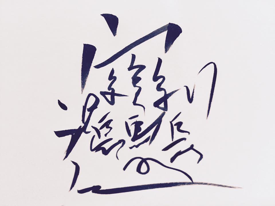
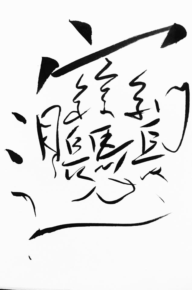
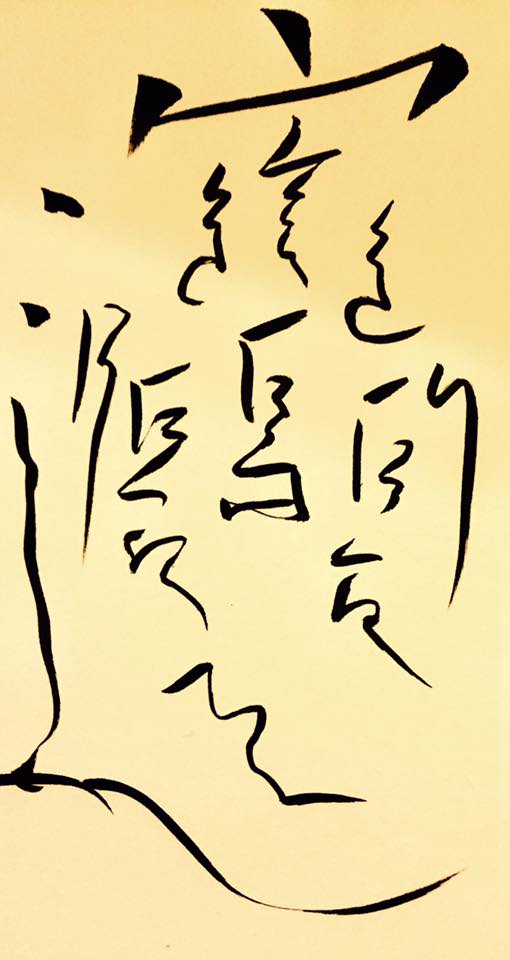
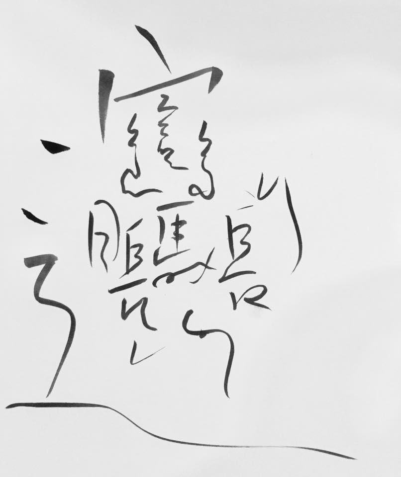
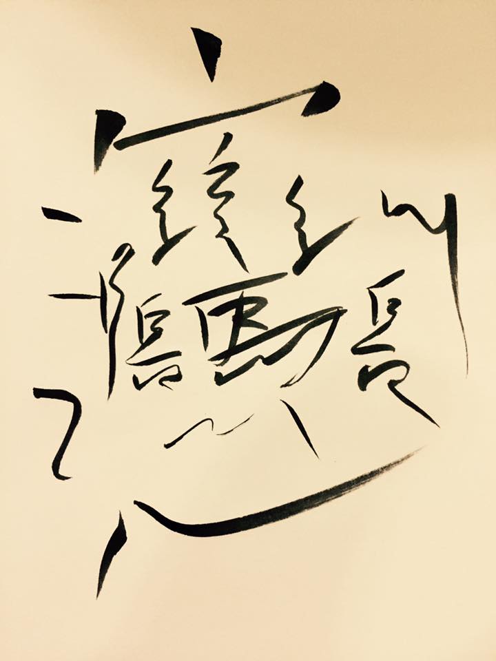
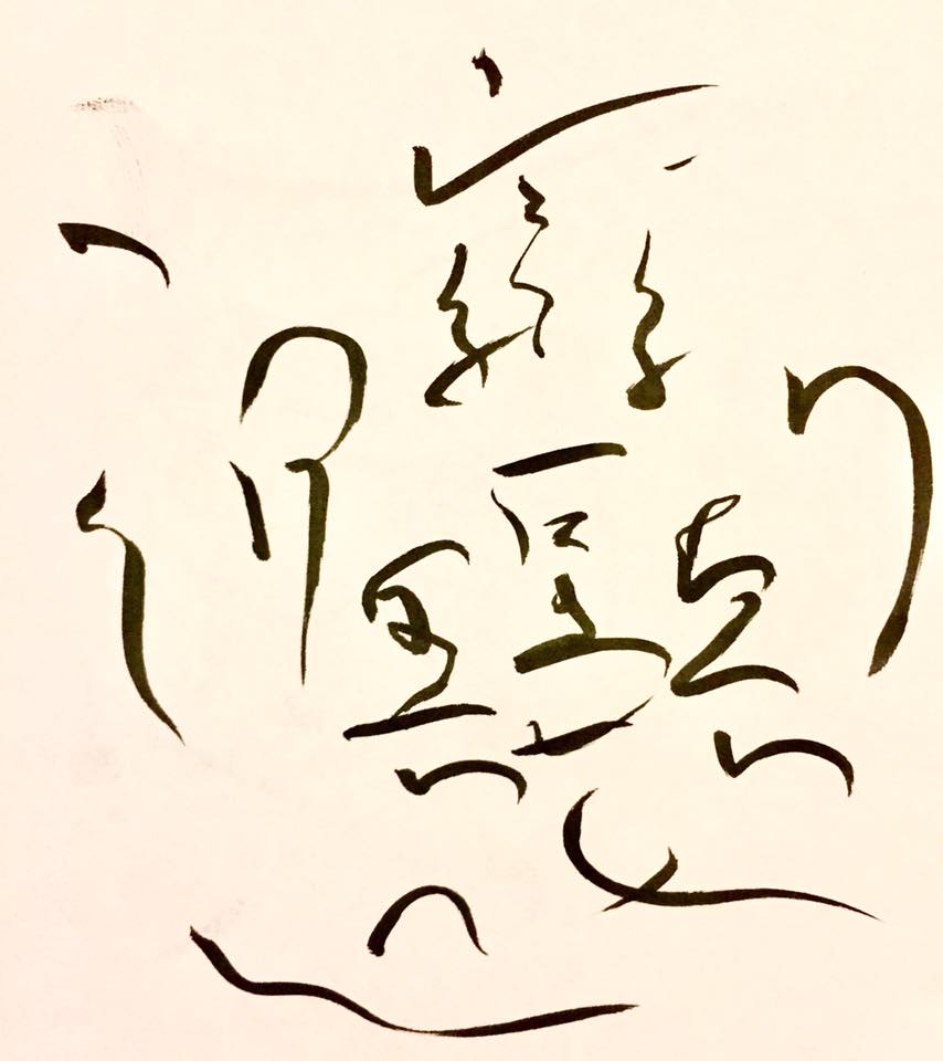
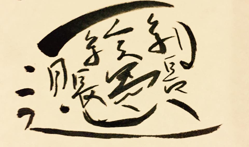
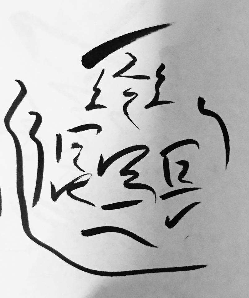
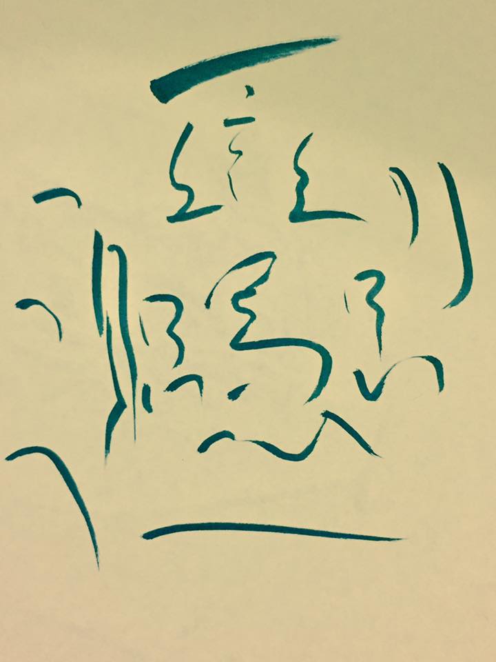
Here are some more of my calligraphic adventures with a Daiso calligraphy pen! Most of these are of biāng, otherwise known as ‘the most complicated Chinese character in existence’ (it’s actually the name of a noodle dish – biāng biāng miàn – from around Xī’ān). Unlike my previous post of qíng ‘love’, these ones are not at all intended to be ‘beautiful’, but rather taking a bit of a ‘modern art’ mindset and seeing how far I could take this character and what kinds of ‘personalities’ I could show through it without ‘breaking’ it (I should say at this point that I’m NOT a calligraphy or really learning it properly, just a creative person who likes to experiment). Let me know what associations you make with each ‘style’ in the comments!
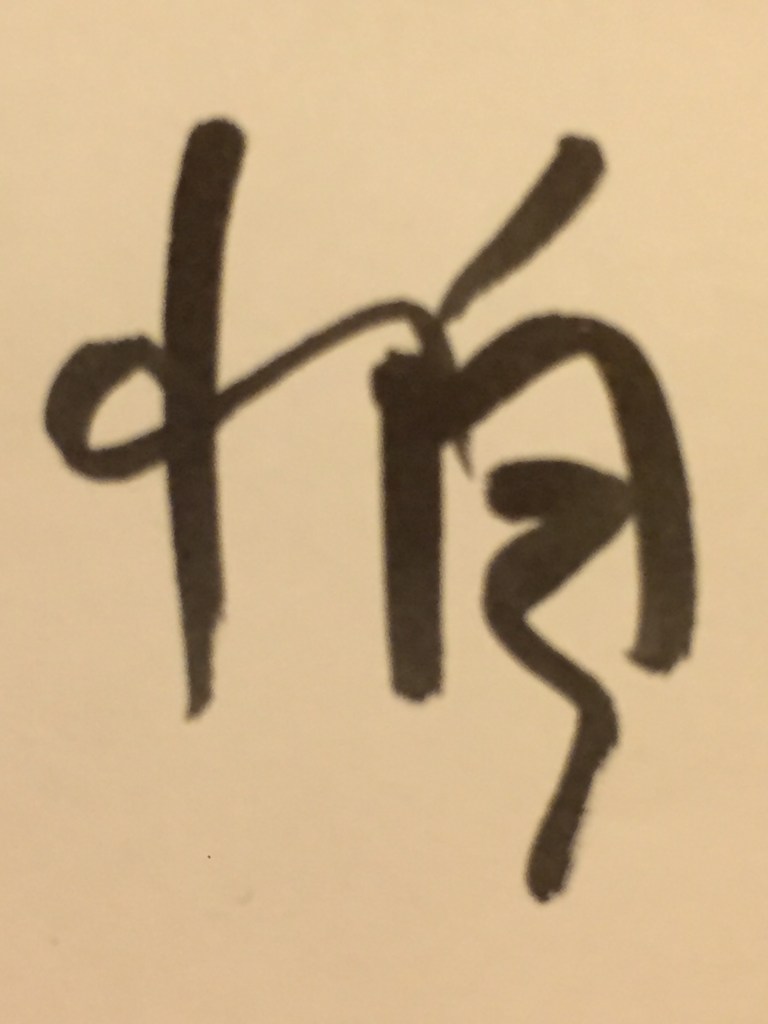
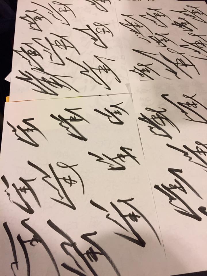
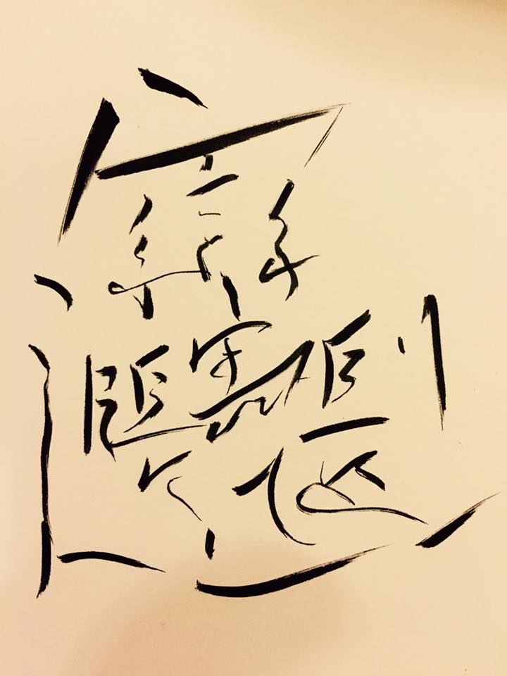
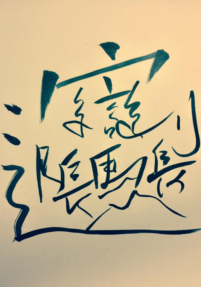
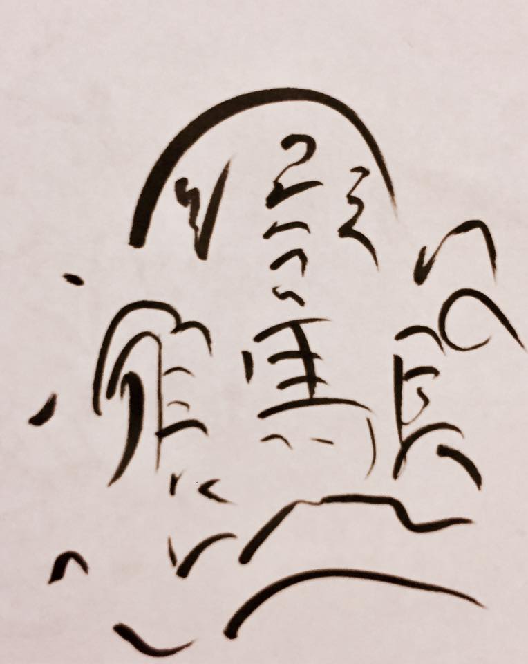
◄ a fluid darkness ► 怕 from 害怕 ‘fear’. Now that I think of it, it’s written in quite a ‘soft’ and ‘flowing’ style, but with quite an opressive dark thickness – quite like fear itself.◄ That’s Ma’ Horse! ► A page of horses – 馬, which is the 繁体字 for 马. I tried to capture the idea of the horse’s motion here. I wrote this out about 50 times – passionate learner or psychopath? You decide! Biāng – light and whispy like a ◄ flicker dances on water ►Biāng – trying to get a sense of all of the components heading in the same direction, as if they want to ◄ follow the wind ►Biāng – I think the 刀 is pretty good on this one, like a ◄ playful blue blade ►Biāng – I think I was trying to make every component character look basically the same – ◄ uniquely similar ►Biāng – starting to look like a human face! As I kept on with this series of styles, I tried to get towards writing each component character with only a single stroke and was actively trying to make the individual characters look a bit like (old) Mongolian script ◄ formless form ►Biāng – trying to capture the similar ‘soft, curving strokes’ in each of the parts ◄ gracefully tentative ►Biāng – getting closer to 1 stroke for each whole character component. I think my roof up the top is getting a bit better – and I reckon the 月 on the left-hand-side is pretty snazzy ◄ whispers of black on sand ►Biāng – this is definitely starting to for the shape of a face now – I like the way the strokes are starting to look a little reminiscent of Arabic and as though each one was only ◄ fleetingly lingering ►Biāng – the idea for this one was to make the overall shape of the character an oval – like an eye, the stroke at the top that represents the roof seeming like an eyebrow and the dots on the left giving a sense of ‘life’; I don’t know why but this really does give me an Arabic-esque / Eye of Ra-type vibe ◄ so many deserts seen ►Biāng – and there we go – it’s finally become a calligraphic approximation of a face! The thickness of the strokes and the dichrome colour-scheme give a Japanese, zen-like aesthetic ◄ into or out of darkness ►Biāng – I think with this one that I was trying to draw more attention to the ‘framing’ elements and make the inside parts all look like a homogenous picture ◄ lake bounded by cliff ►Biāng – I don’t know about you guys, but this one really gives me a ‘skeleton’ / ‘bone’ vibe. I like it, but it also makes me feel uneasy when I look at it. ◄ calligraphic carrion ►